

What’s In A Name? EVERYTHING!
What’s In A Name? EVERYTHING!
A seal of conviction.


The Harappa name evokes a lot of curiosity: just as we had hoped! Why are we called Harappa is a question smart potential recruits always ask. As do clients and partners.
Branding experts will tell you that a name which prompts conversation is a job well begun :).
Almost as much as building an online learning institution, forging a brand that stands for something in the world is one of my key entrepreneurial motivations. I’ve always been deeply fascinated by brands, and the convergence of design, strategy and company mission that a brand melds together. The power of a brand can be transformative for any business.
Company name and logo are any brand’s foundational artefacts and assets. They pack in so much meaning within them: deep personal meaning and soaring founder aspirations and inspirations, to begin with.
My co-founder Pramath and I have been deeply united on many values of the business, including our shared vision and custodianship of the brand. As proud Biharis and Hindi language lovers, and enthusiasts of Indian textiles, art, music and food, we’re always drawn to names and imagery that have the rich spirit of our heritage.
Harappans know this about us. You have to come to our office, and see the gorgeous art that hangs there, courtesy Pramath’s wife, Gauri, who curates Madhubani and Gond art (my favorite!), as well as the distinctly-Indian fabric panels and upholstery we’ve picked, to immediately understand our love for both symmetry and clean lines, as well as the richness of Indian colors, motifs and styles.

Yet, in late 2017, when we were wordsmithing the brand name (we were incorporated on March 14, 2018), we traversed a wide range of possibilities. Our vision to build a high-quality, global and modern online venture was resolute.
We understood that single-word brand names like Google, Yahoo and Intel have special charisma. They are seemingly simple, succinct, hip, global and futuristic. We wanted a name that shared what we loved about these brand names. But, we were determined that the name must have a strong nod to India. We battled through 50+ names, including countless options that unimaginatively played on the word “ed.” They all seem forced and boring.
We finally settled on IndiaX, our first working title, an ode to the exponential potential of India. It was representative of our spirit and vision but it wasn’t magical and couldn’t be exported. It did have enough of the soaring optimism and conviction of purpose to get us started so we decided to keep it, and to continue looking for a name that we would eventually not just like, but love!
We were simultaneously working on a fellowship idea (a passion project of sorts) to attract incredible academics to work in India, through a grant. It was to be called The Harappa Fellowship. We were evoking the excellence of the civilization as a call to gifted academics to ground their work in India.
Thankfully, the passion project hadn’t gone too far when we thought: how about we call our new venture Harappa?
There’s a lyrical quality to the word Harappa. It is a word that could be reinvented and made contemporary for a tech-enabled business. It certainly fulfilled a key aspiration: a name that was a hat-tip to the civilizational fabric of India, and had the intrinsic power and quirk to be global, just like our ambitions. After all, we hoped that for those outside of India, who don’t have the strong association with Harappa as we do, the word would be fun and cool, like a Google or Yahoo!
Once the name was decided, the associations were instantly intuitive. Like the ancient civilization, we like to believe we are pioneering a new frontier of excellence—one that stands at the intersection of education, technology and impact. The Harappan civilization’s timeless, enduring memory in the mind of Indians, is a hope all founders and builders have of creating something that exists above and beyond them. We felt that our curriculum of cognitive, social and emotional skills had the same texture of the grounded and foundational imagery of the Harappa archaeological sites: our skills are foundational to an individual’s life and growth.
Of course, not everybody thought the name was a good fit! We’ve had so many skeptics and the main concerns were that for all our India-focus, Harappa is in modern-day Pakistan! Or, that there was a certain morbidity to naming something new after a civilization that died an unexplained death. Or, the incongruous logic of naming something tech-enabled and “start-uppy” after an ancient, historical world. Were we getting our tenses mixed up?
For me, though, the day we decided to go ahead with the name Harappa was one of the three most crucial points in my journey as a founder: the gravitas of the name, the associations we built around it and the sense of responsibility it placed has served as an unshakeable emotional anchor during our first year, when all you have is the boldness of your dreams to keep you motivated.
I have always believed that there is great power in names - with Harappa, I have seen it play out.
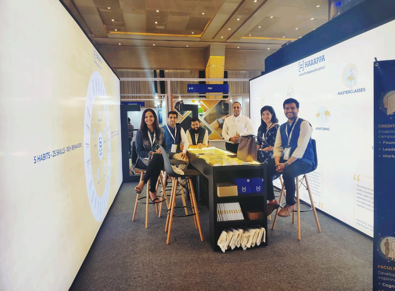
The Logo
If you look at our logo, it’s actually the top shot image of Harappan excavation sites. All you need to do is Google to get a stream of such images.
Our pair of fantastic designers, who also happen to be very, very close friends of mine, and are interestingly both architects, helped us create something that captured the scope of our ambition.
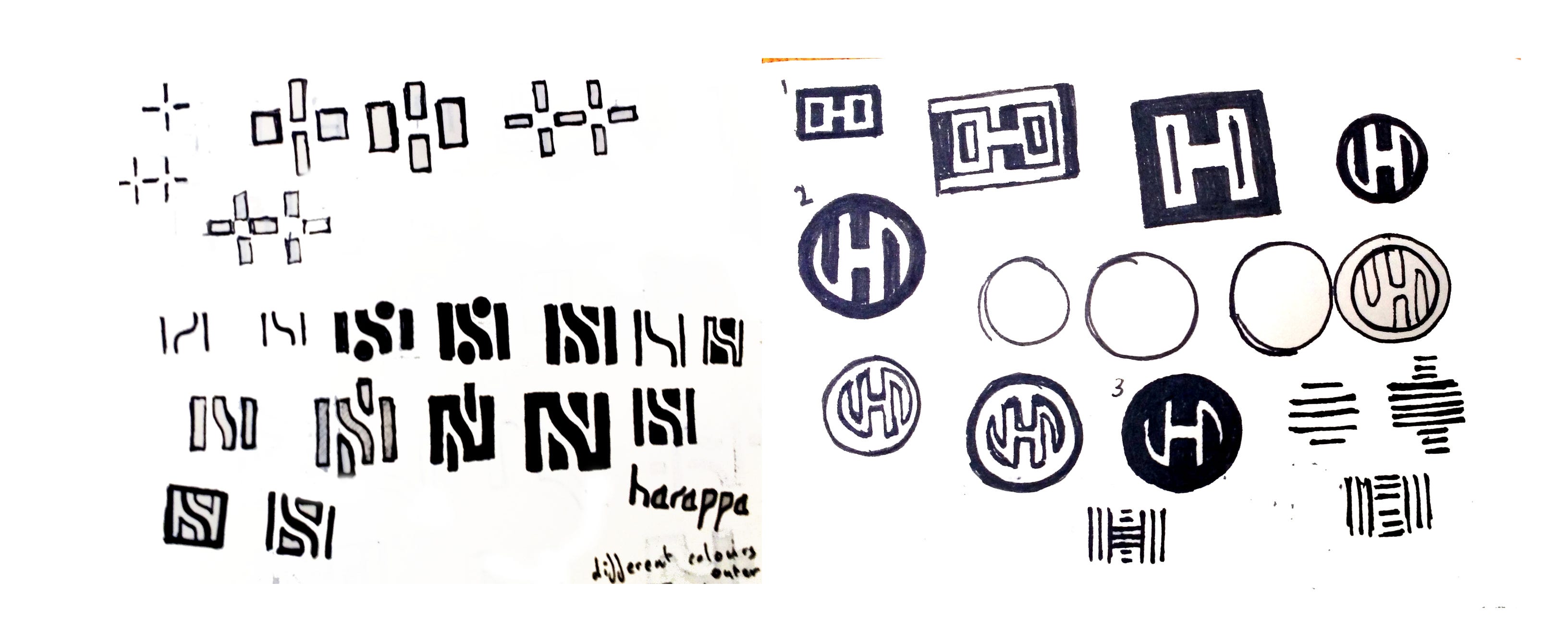
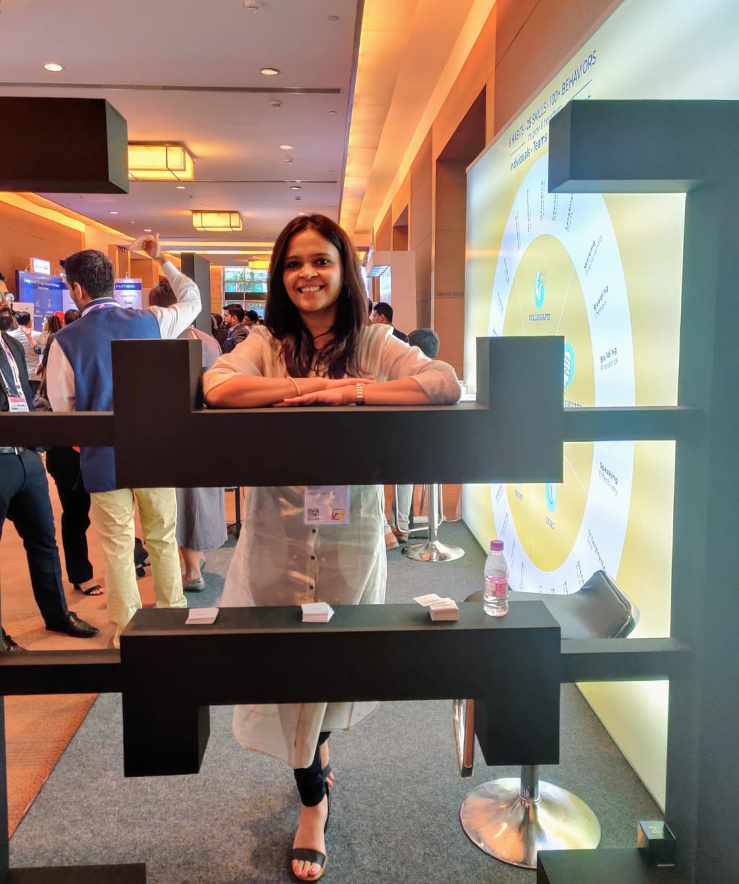
Our logo echoes the Harappan courtyards as seen from above—a pair of brackets forming the geometry of the unmistakable ‘H’ in our logo. It’s square shape is derived from the Indus Valley Civilization’s seals, another iconic artefact we have of Harappa, and that you can see in most museums about Harappa. Carved from stone and then tempered in flames, these square tablets depict a culture and civilization in the bloom of health. Through its angular lines and symmetrical layout, our logo strives to reimagine the architectural and technological advancement of the period.

The geometric, square pattern ensured that the logo and typeface (angular and tall) effortlessly manifested our brief to our designers: to make “our” Harappa look and feel contemporary, modern, hip and global. The logo’s palette of monochromatic white and black made it even slicker and of today.
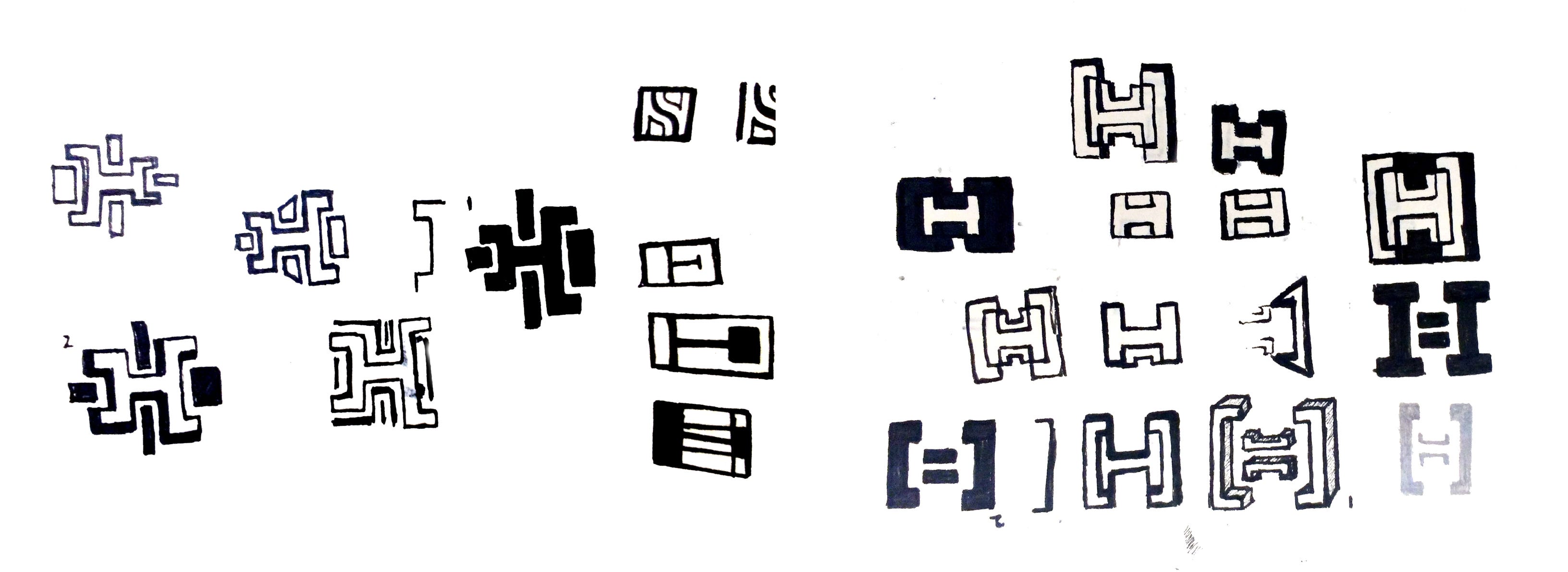
The logo is also symbolic of the virtual campus of the future. Its symmetry and square shape represent equality and balance. Distinctive yet modular, structured yet fluid, the spaces within the logo symbolize a place to meet, interact and exchange knowledge.
The logo has become so core to our brand identity now; and the Harappa inspiration, and the imagery of courtyard, open spaces has significantly shaped the way we design our office spaces too.

The solidity of the geometry combined with the pop of bright, contemporary colors from our brand guidelines has given us the ingredients to create an identity that seems strong, modern and fresh.
The logo’s versatility has fuelled our creativity. We’re looking at how the logo can be made more digital and gamified. Brace up for some “brackets” fun! That’s the next evolution of the logo: to build more sensory recognition for the brand, including giving a sonic identity to Harappa, keeping in pace with how voice is making a comeback with voice search, social audio and podcasting.
I can’t imagine Harappa being anything but Harappa. I know for sure we would not be who we are, and what we are, if we weren’t called Harappa. The identity has inspired us to build a company that can live up to its name: for us, a civilizational purpose!
Thanks for sharing this Shreyasi. Stories behind genesis of great company names are always lovely, and this one if no different. :)
Thanks for sharing the story of "Harappa". Now you have made us all Biharis feel prud of the association.
You Guys have class!!! I am planning to return to India soon. Do give me a shout if you need any help from a Consulting Firm. It will be an hor to support you.